Code
# Load necessary Libraries
library(DESeq2)
library(ggplot2)
library(dplyr)
library(tidyverse)
library(EnhancedVolcano)
library(gplots)
library(RColorBrewer)For this assignment and for effectiveness and expressiveness part, I’m using my dataset that contains differentially expressed genes between ovaries and testis of a syngnathid fish. I have attached all the datasets used for this assignment in my marks and Channel folder.
First load the packages and libraries.
# Load necessary Libraries
library(DESeq2)
library(ggplot2)
library(dplyr)
library(tidyverse)
library(EnhancedVolcano)
library(gplots)
library(RColorBrewer)# Datasets ( Ovaries and Testis)
S_ovaries <- read.csv("C:/Users/farli/OneDrive/Documents/sygnathus scovelli.rnaseq data/Final_count_of_all_tissue_syngnathus_scovelli/final_count_ss_ovaries.csv", header = TRUE, row.names = 1, sep = ",")
S_testes_oldref <-read.csv("C:/Users/farli/OneDrive/Documents/sygnathus scovelli.rnaseq data/Final_count_of_all_tissue_syngnathus_scovelli/final_count_ss_testes_oldrefgen.csv", header = TRUE, row.names = 1, sep =",") Conduct the Differential Gene Expression Analysis before visualization or plotting.
#Combine all the file together but different rows means different gene number
S_OT <- cbind(S_ovaries, S_testes_oldref)

#Subset the Counts data for each of the different conditions
All <- S_OT[, c(1:12)]
SFO_vs_SPT_count_table <- S_OT[, c(1:5, 8:12)]
SFO_vs_SNPT_count_table <- S_OT[, c(1:5, 6:7)]

##test
#Create the conditions for each of them
All_condition <- c(rep("SFO",5), rep("SNPT",2), rep("SPT",5))
SFO_vs_SNPT_condition <- c(rep("SFO", 5), rep("SNPT", 2))
SFO_vs_SPT_condition <-  c(rep("SFO", 5), rep("SPT", 5))
###########################

#test
coldata_ALL <- data.frame(row.names = colnames(All), All_condition)
coldata_SFO_vs_SNPT <- data.frame(row.names = colnames(SFO_vs_SNPT_count_table), SFO_vs_SNPT_condition)
coldata_SFO_vs_SPT <- data.frame(row.names = colnames(SFO_vs_SPT_count_table), SFO_vs_SPT_condition)
############################

dds_ALL <- DESeqDataSetFromMatrix(countData = All,
                                  colData = coldata_ALL,
                                  design = ~All_condition)

dds_SFO_vs_SNPT <-  DESeqDataSetFromMatrix(countData = SFO_vs_SNPT_count_table,colData = coldata_SFO_vs_SNPT,
                                           design = ~SFO_vs_SNPT_condition)
dds_SFO_vs_SPT <-  DESeqDataSetFromMatrix(countData = SFO_vs_SPT_count_table,
                                          colData = coldata_SFO_vs_SPT,
                                          design = ~SFO_vs_SPT_condition)

################################
dds_ALL <- DESeq(dds_ALL)
dds_SFO_vs_SNPT <- DESeq(dds_SFO_vs_SNPT)
dds_SFO_vs_SPT <- DESeq(dds_SFO_vs_SPT)

###########################
# Calling results without any arguments will extract the
# estimated log2 fold changes and p values for the last variable in the design formula
res_all <- results(dds_ALL)
res_SFO_vs_SNPT <- results(dds_SFO_vs_SNPT)
res_SFO_vs_SPT <- results(dds_SFO_vs_SPT)

#mcols is basically shows metadata column names
mcols(res_all, use.names = TRUE)
DataFrame with 6 rows and 2 columns
type description
<character> <character>
baseMean intermediate mean of normalized c..
log2FoldChange results log2 fold change (ML..
lfcSE results standard error: All ..
stat results Wald statistic: All ..
pvalue results Wald test p-value: A..
padj results BH adjusted p-valuessum(res_SFO_vs_SNPT$padj < 0.05, na.rm = TRUE)[1] 12580sum(res_SFO_vs_SNPT$padj < 0.05, na.rm = TRUE)[1] 12580###########################
#removing na values
sigs_all <- na.omit(res_all)
sigs_SFO_vs_SNPT <- na.omit(res_SFO_vs_SNPT)
sigs_SFO_vs_SPT <- na.omit(res_SFO_vs_SPT)
sigs_SFO_vs_SNPT <- sigs_SFO_vs_SNPT[sigs_SFO_vs_SNPT$padj < 0.05,]
sigs_SFO_vs_SPT <- sigs_SFO_vs_SPT[sigs_SFO_vs_SPT$padj < 0.05,]
sigs_all <- sigs_all[sigs_all$padj < 0.05,]In my first figure I use colour hues to express effectively the result. Below you can see 3 differnt colours represent clustering of 3 different samples. SFO = Syngnathus Female Ovaries SNPT = Syngnathus Non Pregnant Testis SPT = Syngnathus Pregnant Testis. This colours cleary expressing how different ovaries and Testis.
#rlog transform for application not for differential testing
rld <- rlog(dds_ALL)#PCAplot, plotPCA which comes with DESeq2.
# Run PCA and store the ggplot object
pca_plot <- plotPCA(rld, intgroup = "All_condition")using ntop=500 top features by variance# Customize colors using ggplot2
pca_plot + scale_color_manual(values = c("red2","blue",
"magenta2"))+
labs(title = "PCA Plot of S_ovaries and S_Testis",
x = "PC1:84% Variance",
y = "PC2:4% Variance",
color = "Sample Groups") + # Add legend title
theme_minimal()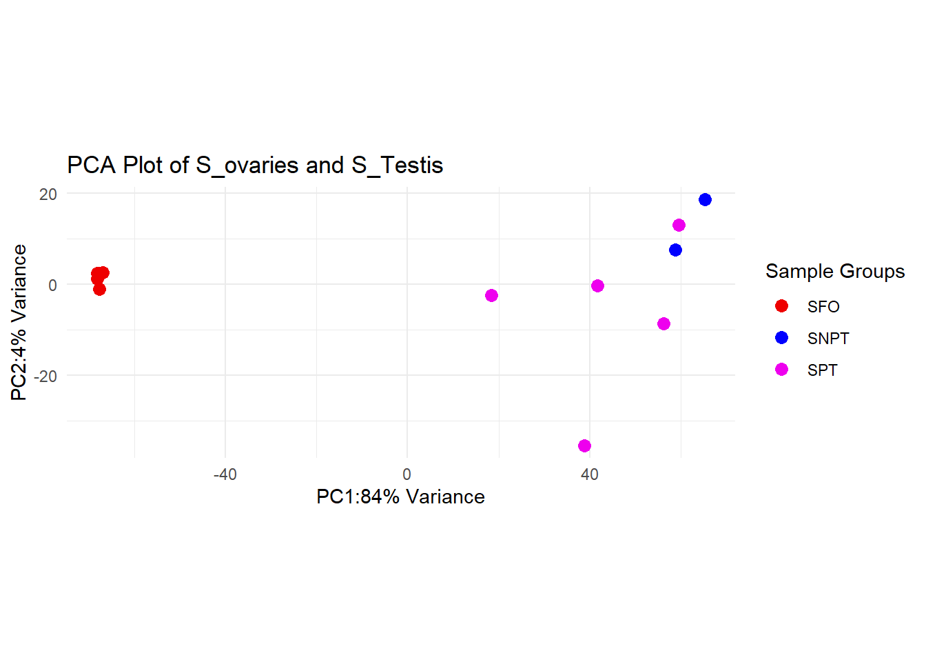
##Figure 2 In figure 2 we can see the violations of the principle of expressiveness and effectivemness. As, now we can’t differentiate which one what and thus can’t say if it’s clustering or not. I used points as the marks which all identical and that’s why meaningless.And the channel is colour which I used same blue colour for every sample making it hard to distinguish the cluster.
pca_plot +
  scale_color_manual(values = c("blue", "blue", "blue"))+
  labs(title = "PCA Plot",
       x = "PC2: 99% Variance",  # Incorrect variance
       y = "PC1: 1% Variance",   # Swapped values to mislead
       color = "Totally Random Groups") +  # Meaningless legend
  theme(
    panel.background = element_rect(fill = "grey"),  # Extreme background color
    plot.title = element_text(size = 40, color = "red", face = "bold"),  # Overpowering title
    axis.text = element_text(size = 10, color = "white"),
    legend.position = "none")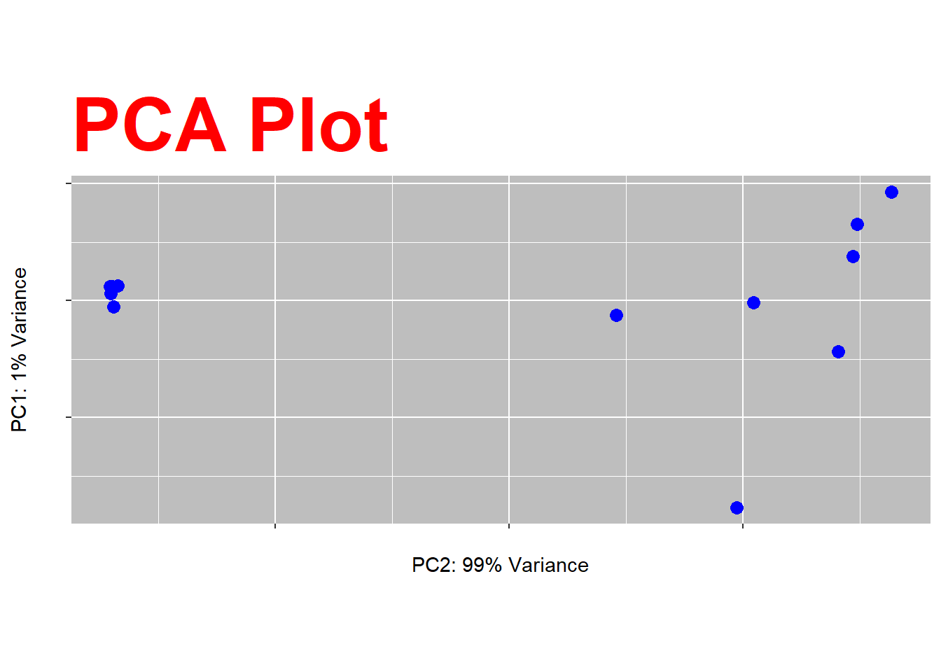
For the second part I tried to see the overall distribution of genes in ovaries and testis. I use bars as the marks and and length/height as channel
S_ovaries <- read.csv("C:/Users/farli/OneDrive/Documents/sygnathus scovelli.rnaseq data/Final_count_of_all_tissue_syngnathus_scovelli/final_count_ss_ovaries.csv", header = TRUE, row.names = 1, sep = ",")
S_testes_oldref <- read.csv("C:/Users/farli/OneDrive/Documents/sygnathus scovelli.rnaseq data/Final_count_of_all_tissue_syngnathus_scovelli/final_count_ss_testes_oldrefgen.csv", header = TRUE, row.names = 1, sep =",")

#Histogram to check overall gene distribution
#making a dataframe of sum of all row count
S_tst_hist <- data.frame(rowSums(S_testes_oldref))
S_ov_hist <- data.frame(rowSums(S_ovaries))

#changing the column names
names(S_tst_hist)[1] <- "c1"
names(S_ov_hist)[1] <- "c3"

x_limits <- c(1, 1e07)  # Adjust based on your data range
y_limits <- c(0, 1000)   # Adjust to match both plots
y_breaks <- seq(0, 1000, by = 250)  # Ensure consistent y-axis breaks
x_breaks <- c(10, 1000, 100000, 1e07)  # Adjust log-scale

# Example for first dataset
ggplot(S_tst_hist, aes(x = c1)) +
  geom_histogram(fill = "blue4", color = "black", bins = 100) +
  scale_x_log10(limits = x_limits, breaks = x_breaks) +
  scale_y_continuous(limits = y_limits, breaks = y_breaks) +
  labs(title = "Distribution of Overall Gene Counts Across S.scoveli Testis",
       x = "Log(total counts)", y = "Frequency") +
  theme_gray()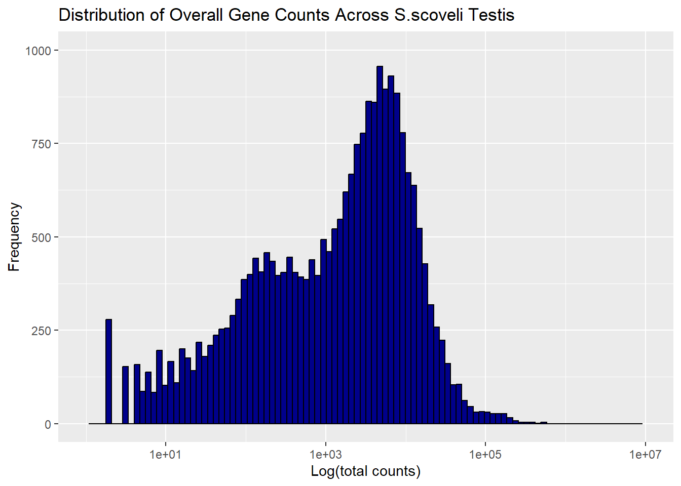
ggplot(S_ov_hist, aes(x = c3)) +
  geom_histogram(fill = "blue4", color = "black", bins = 100) +
  scale_x_log10(limits = x_limits, breaks = x_breaks) +
  scale_y_continuous(limits = y_limits, breaks = y_breaks) +
  labs(title = "Distribution of Overall Gene Counts Across S.scoveli Ovaries",
       x = "Log(total counts)", y = "Frequency") +
  theme_gray()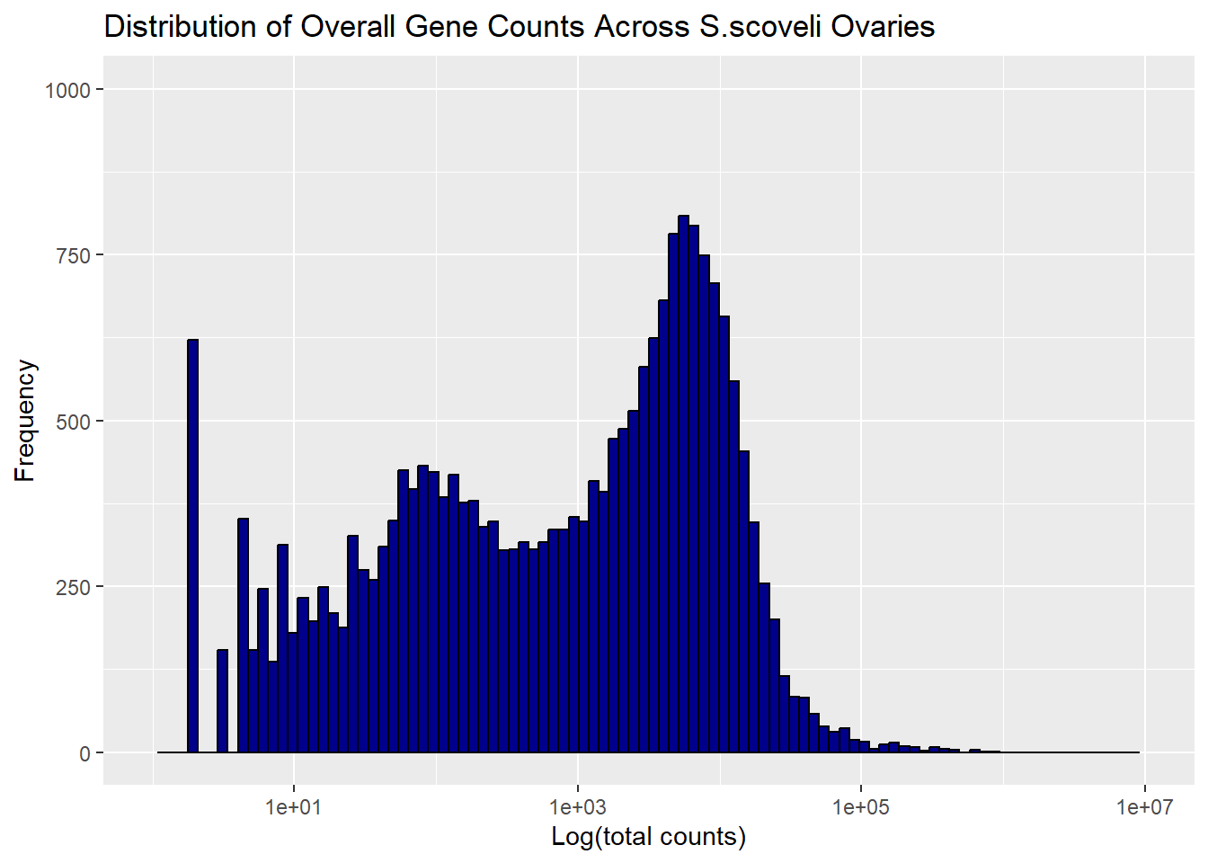
In the figure 4 it violated the discriminability, Beacuse you can’t properly measure the frequency of genes and overall distribution.
S_ovaries <- read.csv("C:/Users/farli/OneDrive/Documents/sygnathus scovelli.rnaseq data/Final_count_of_all_tissue_syngnathus_scovelli/final_count_ss_ovaries.csv", header = TRUE, row.names = 1, sep = ",")
S_testes_oldref <- read.csv("C:/Users/farli/OneDrive/Documents/sygnathus scovelli.rnaseq data/Final_count_of_all_tissue_syngnathus_scovelli/final_count_ss_testes_oldrefgen.csv", header = TRUE, row.names = 1, sep =",")

#Histogram to check overall gene distribution
#making a dataframe of sum of all row count
S_tst_hist <- data.frame(rowSums(S_testes_oldref))
S_ov_hist <- data.frame(rowSums(S_ovaries))

#changing the column names
names(S_tst_hist)[1] <- "c1"
names(S_ov_hist)[1] <- "c3"

x_limits <- c(1, 1e07)  # Adjust based on your data range
y_limits <- c(0, 1000)   # Adjust to match both plots
y_breaks <- seq(0, 1000, by = 250)  # Ensure consistent y-axis breaks
x_breaks <- c(10, 1000, 100000, 1e07)  # Adjust log-scale

# Example for first dataset
ggplot(S_tst_hist, aes(x = c1)) +
  geom_histogram(fill= "blue4",color = "black",bins = 1000)+
  scale_x_log10(limits = x_limits, breaks = x_breaks) +
  scale_y_continuous(limits = y_limits, breaks = y_breaks) +
  labs(title = "Distribution of Overall Gene Counts Across S.scoveli Testis",
       x = "Log(total counts)", y = "Frequency") +
  theme_gray()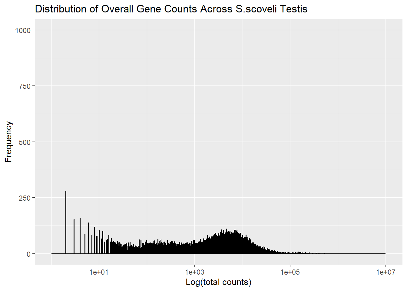
ggplot(S_ov_hist, aes(x = c3)) +
  geom_histogram(fill = "blue4", color = "black", bins = 1000) +
  scale_x_log10(limits = x_limits, breaks = x_breaks) +
  scale_y_continuous(limits = y_limits, breaks = y_breaks) +
  labs(title = "Distribution of Overall Gene Counts Across S.scoveli Ovaries",
       x = "Log(total counts)", y = "Frequency") +
  theme_gray()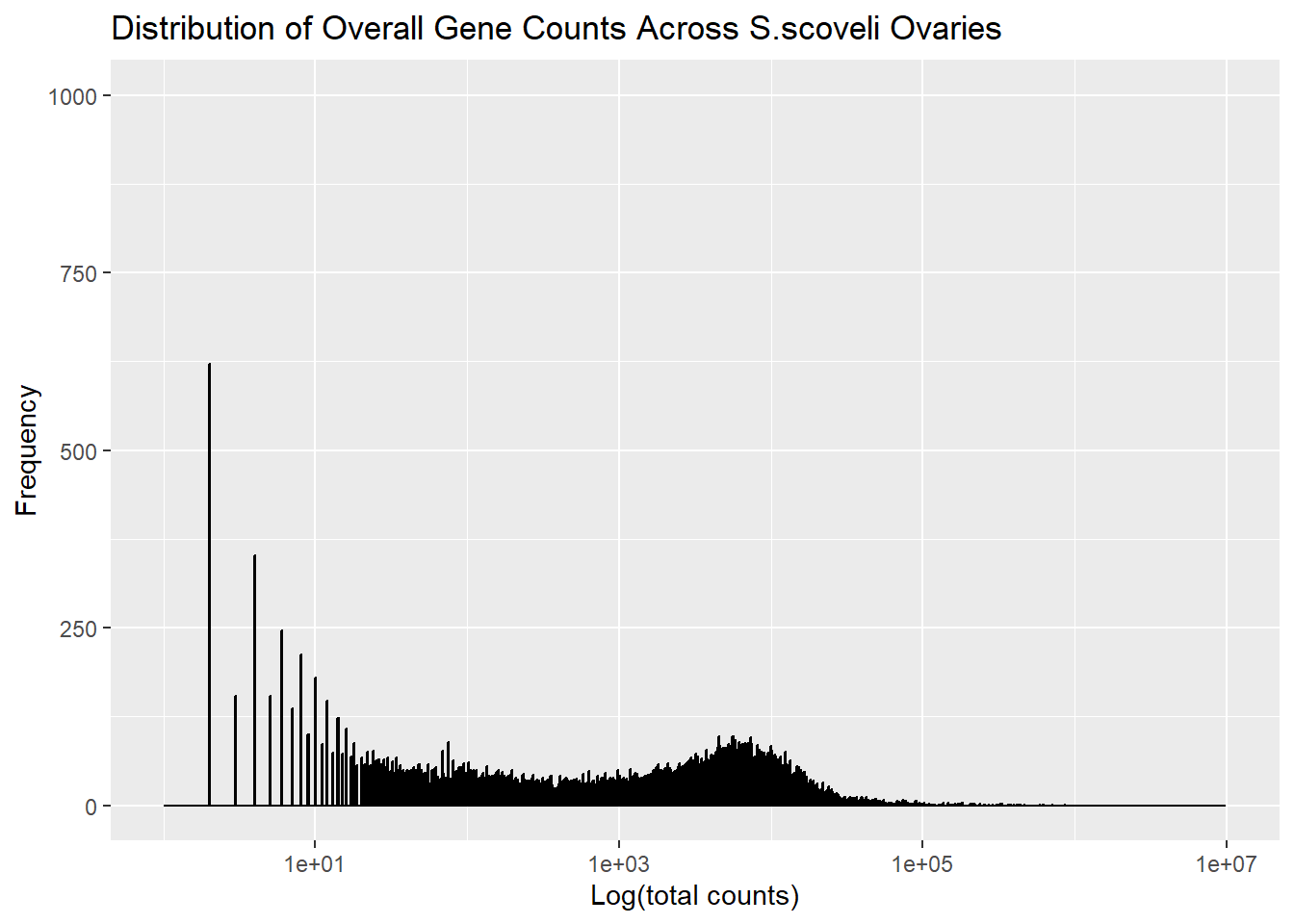
#Separability #Figure 5 In the separability part, I choose rectangular cells as marks and colour gradient as channels. In the figure is showing clearly some genes are really off in ovaries while those genes are on in testis making it clear that this dimporphic tissues have so many genes that expressed differntially.
rld <- rlog(dds_ALL)
topVarGenes <- head( order( rowVars( assay(rld) ), decreasing=TRUE ), 35 )
heatmap.2(assay(rld)[topVarGenes, ],
          scale = "row", trace = "none",
          dendrogram = "column",
          col = colorRampPalette(rev(brewer.pal(9, "RdBu")))(255),
          cexRow = 0.6,  # Adjust row label size
          cexCol = 0.7,
          main = "S_Ov vs S_T")  # Adjust column label size)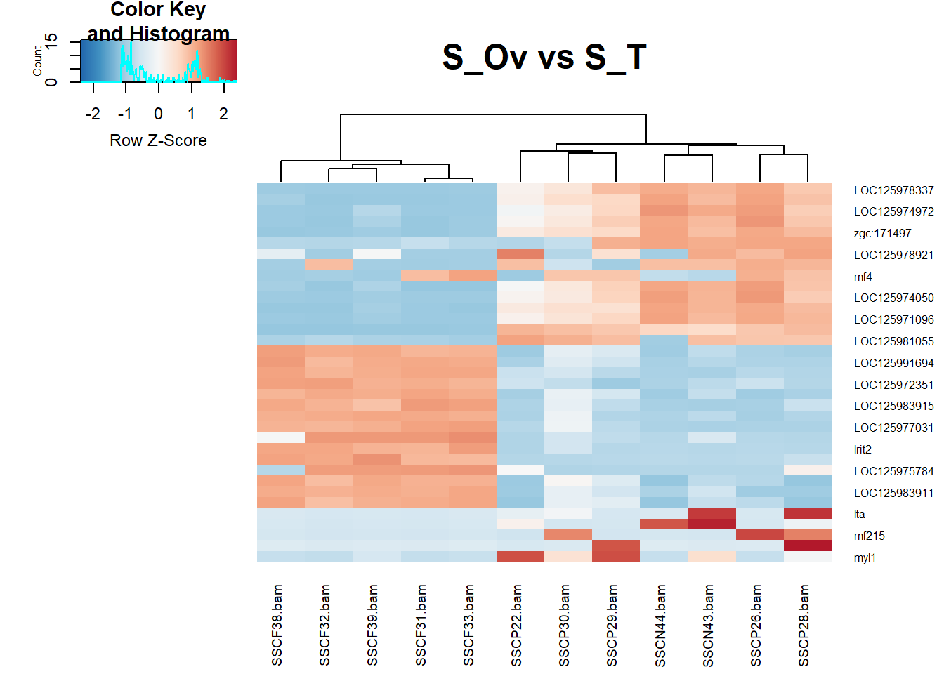
heatmap.2(assay(rld)[topVarGenes, ],
          scale = "column",  # Scale by column, which distorts comparisons
          trace = "both",  # Add excessive trace lines
          dendrogram = "none",  # Remove dendrograms to make the relationships unclear
          col = colorRampPalette(rev(brewer.pal(9, "RdGy")))(255),  # Poor color choice with low contrast
          cexRow = 2,  # Excessive row label size that clutters the plot
          cexCol = 2,  # Excessive column label size that clutters the plot
          main = "S_Ov vs S_T (Bad Plot)",  # A non-informative, cluttered title
          density.info = "none",  # Remove density information for confusion
          key.title = "Expression Levels",  # Confusing legend title
          key.xlab = "Expression",  # Unclear labeling
          key.ylab = "Samples")  # Unnecessary Y-axis label in the legend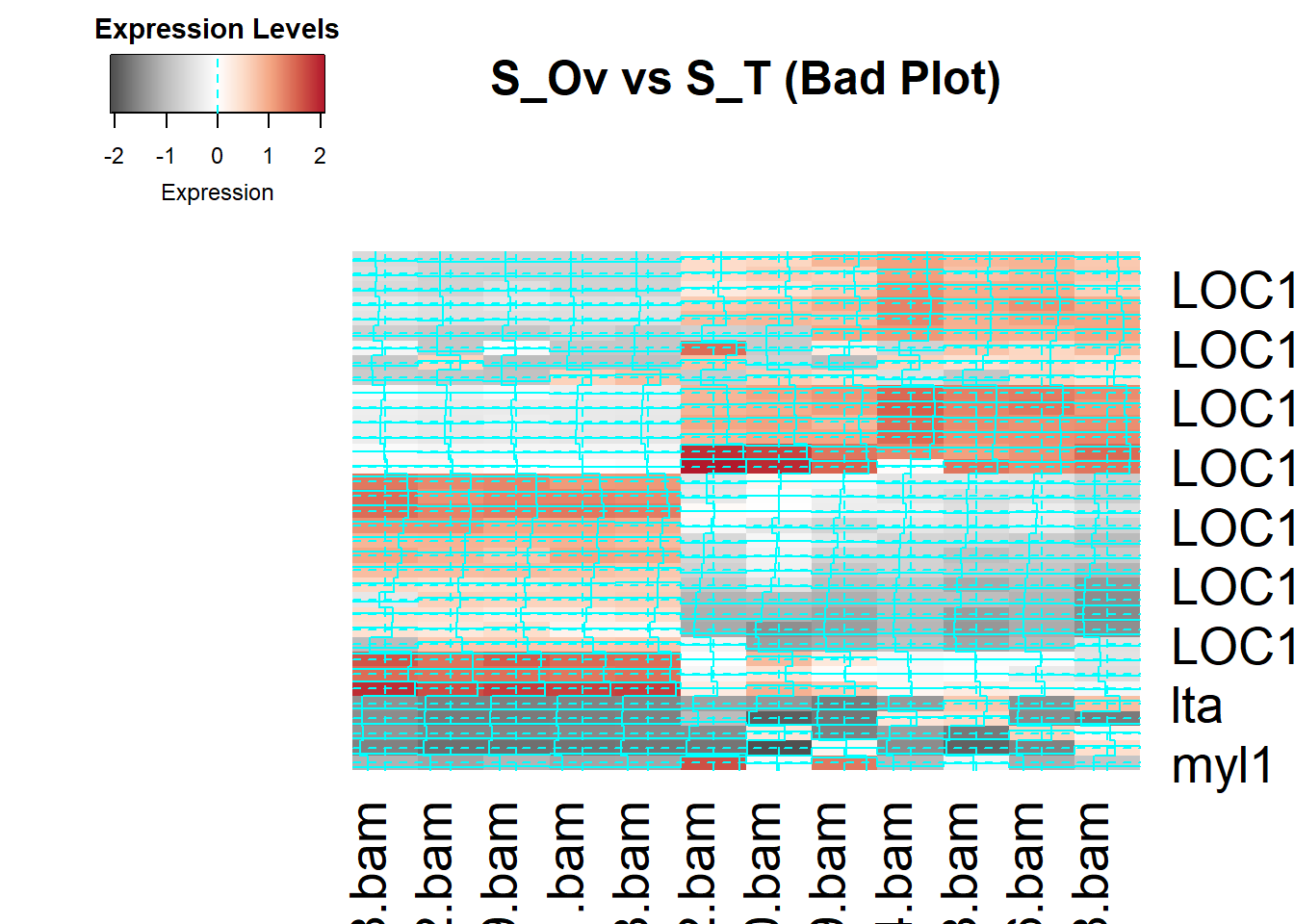
#PopOut/ Figure 7 For popout i used points as marks and colour as channel.
#Popout/ Figure 8 In this figure I tried to violate the principles of Popout, making it hard to ditinguish what we are looking for. I tried to remove the blue popout colour but it’s not working. However now I expand the y-axis too much which shrinks the genes in a way that we can’t say which genes are differntially expressed and which are not. Figure 8 sucks because all marks are clumped together, and made the plot meaningless to explain.